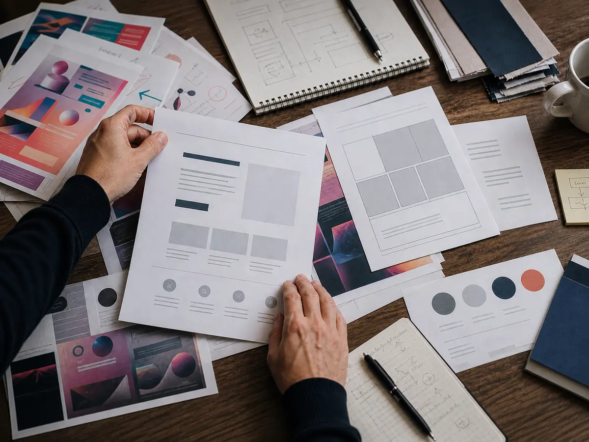
The past few years of web design have been loud. Strong gradients, heavy 3D, brutalist contrasts and visual expressions competing for attention on every front at once.
Now a shift is underway. Not dramatic, but unmistakable. Critics call it a quiet rebrand: fewer effects, cleaner typography, more breathing room, clearer hierarchy. Not because designers have become boring, but because users are tired of websites that shout without saying anything.
From wow effect to working calm
Neubrutalism, bright gradients and complex 3D elements can be effective when used correctly. The problem is that such trends are often copied without strategy. Then a website can look modern for five minutes but feel heavy, cluttered or demanding to use.
The new direction is more about functional minimalism. That does not mean empty pages or generic design. It means every visual decision must do a job: make content easier to understand, help the user move forward, load fast on mobile, support the brand without drowning the message, and make the site easier to maintain over time.
It is a more mature form of design. Less decoration for decoration's sake, more precision.
Bento Grid fits right in
Bento Grid layouts have become popular because they give structure without the page feeling rigid. They let a business show services, benefits, numbers, processes and cases in clear blocks that are easy to scan.
For the user it means less searching. For the business it means the message can be prioritised better. For SEO it often means cleaner content structure, better internal linking and a page that can be built around genuine search intent.
That is exactly why this trend makes sense: it is not just visual. It supports user experience, performance and visibility at the same time.
What this means for small and medium-sized businesses
Many businesses do not need a website that tries to look like a technology conference. They need a website that explains what they do, builds trust and makes it easy to get in touch.
Fast mobile experience, clear typography, good images, clear sections and language that feels human can often deliver more impact than large animations and heavy visual frameworks.
This is especially important when the website also needs to work as a marketing tool. The design must help SEO, not get in the way of it. It must make the message easier to understand, not more impressive at the cost of conversion.
Design that does its job
At Ibenta we do not build websites to win design awards. We build them to get you found, understood and chosen.
That means every visual decision has a function: support the content, build trust, drive action. Sometimes that is a calm, editorial site. Other times it is stronger campaign pages or clear service flows. It depends on what actually converts for your audience.
Has your website become harder to use than it needs to be? Get in touch: we will analyse what is slowing you down and give you a clear plan for what to fix first.